When creating your website it is important to understand how color can impact your viewers and influence them to interact with your site. Choosing a color scheme goes beyond using your favorite colors or brand colors. Colors make content more engaging and can influence the emotional reaction your viewers have to your content, products, and services.
Studies show that Color can increase brand recognition by up to 80%. This brings up several questions.
- What are the colors and what do they represent?
- What methods or tools are used to create colors?
- How does color contrast affect my site and viewers?
We will go into these questions in more detail to help you understand how color and contrast can improve your site visitation and engage your viewers.
What is the psychology of colors in website design?
Creating colors on a website is achieved through the combination of the RGB computer systems for colored display. RGB represents Red, Green, and Blue which can be combined to display any color visible in the color spectrum.
Research by the Institute for Color Research reveals that “people make a subconscious assessment of an environment, person, or product within 90 seconds of initial viewing – and between 62% and 90% of that assessment is based on color alone.” This is a main concept of color psychology.
Color psychology is used in color branding which uses colors to build an image for your company or influence how people perceive your company. Color is often used to highlight elements like buttons, important texts, and subsections.
This beg the questions, which colors should you use and how do they influence your site viewers?
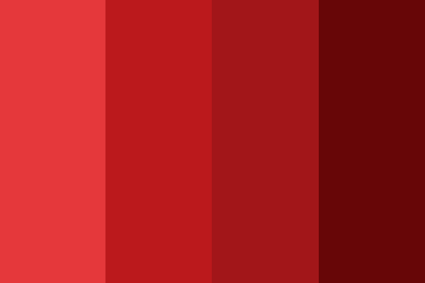
Red
Red is commonly associated with power and urgency. Bright red is energetic and exciting while darker reds come across as authoritative and luxurious.

Blue
Blue represents trust. Bright blue is a sign of creativity while darker blues come across as intellectual or trustworthy.

Green
Green is associated with money, balance, and nature. Shades of green have been effectively used for eco-friendly, health, and technology companies.
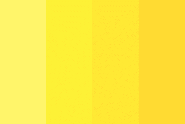
Yellow
Yellow elicits a creative, playful, and unique style. This color is commonly associated with cheerful, excited, and optimistic feelings.
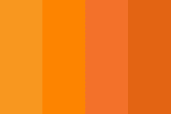
Orange
Orange combines the cheerful and optimistic feelings of yellow with the urgency of red. This is a durable and confident color.

Purple
Purple evokes feelings of sophistication, success, and imagination. While lighter purples appeal primarily to women’s sense of class and elegance, darker purples are associated with serious, mysterious, gloomy, or luxury feelings.

Black
Black is a bold choice for websites that can set you apart from your competition. It can create a classy, high level of contrast to your content and photos.

White
White is a simple, inviting, and fuss-free choice for websites. It is important to note that white space on your site is NOT wasted space when used effectively. Best paired with strong, loud, and bold colors, white is an inviting color that makes content easy to read and photos easy to see
How do you keep colors consistent in web design?
Once the colors have been selected for your websites design, it’s important to consistently use them throughout the website. To do this, we recommend documenting the RGB and/or Hexadecimal values of your different colors. This makes it possible to render that color on any device, and make sure it is showing the same shade of blue, or perhaps orange, on another device.
What is an RGB color value?
The three (3) primary colors used to generate any color on a computer screen are Red, Green, and Blue.
In cascading style sheets (CSS), a built-in function called RGB() allows us to control the intensity of each color on range from 0 – 255. The three colors with different intensities allow us to create all of the color combinations that can be observed on a website today.
Here is an example of how to change a paragraph of text red:
					p {
    color: rgb(225, 0, 0);
}
In the above example, we set a paragraph of text to the color red. This combination returns the red color because it has the highest intensity and the other two colors have 0 intensity.
Through changing the intensities of all three colors you get the different colors such as
- RGB (255, 255, 255) which displays the white color.
- RGB (0, 0, 0) which gives the black color.
What is a hexadecimal color code?
Hexadecimal numbers in CSS also provide a wide range of color values. Hexadecimal values are specified with a “#” sign such as #RRGGBB where, R, G, B are the codes for red, green and blue. Numbers with the combination of 0-9 and A-F are used to represent a color in CSS.
Examples of basic HEX colors are
- #FFFFFF represents the white color.
- #000000 represents the black color.
- #FF0000 represents the pure red color.
- #00FF00 represents the pure green color.
- #0000FF represents the pure blue color.
Below is an example of a border on a box being set to orange.
					table {
    border: 1px solid #ff9900;
}
How do you make elements on a website opaque?
Unfortunately, hexadecimal doesn’t offer transparency. Thus, the RGBA format is used to display colors with Alpha, providing a way to make colors opaque. The RGBA (Red, Green, Blue, Alpha) uses the same 0 – 255 for RGB and a range of 0.0 – 1.0 for transparency. 0.0 represents the fully transparent and 1.0 represents the fully opaque. The opacity or transparency of a color will impact contrast on a page. drawing attention to its use or deterring interest if used improperly.
See below for an example use in CSS, where we make a box with a background of text red, but slightly transparent.
					div {
    background-color: rgba(225, 0, 0, 0.8);
}
How do you design an accessible website?
Arguably the most important question here! As a website designer, we refer to the Web Content Accessibility Guidelines (WCAG). They serve as a guide that all designers and developers can follow to aid in making content online easy to read and interact with.
One tool designers can use to make an element easy to see is contrast. In WCAG, contrast measures the difference in “luminance” or brightness between two colors. This is expressed as a ratio ranging from 1:1 to 21:1. 4.5:1. WCAG2 has a standard contrast ratio for web content to assist people with disabilities in reading content and images on your site. In WCAG2 there are 3 success criteria for contrast settings for AA standards.
- Contrast (Minimum) – applied to large text, incidentals, and logotypes
- Contrast (Enhanced) – has higher contrast requirements set by WCAG AA standards
- Non-text Contrast – has an AA standard for User Interface Components and Graphical Objects
Contrast (Minimum)
The presentation of text and images of text, such as text within a graphic, is required to have a contrast ratio of at least 4.5:1.
- 1:1 is white on white.
- 21:1 is black on white.
- 4:1 is pure red.
- 1.4:4 is pure green.
- 8.6:1 is pure blue.
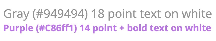
- Gray (#767676) on white.
- Purple (#CC21CC) white.
- Blue (#000063) on gray (#808080).
Red (#E60000) on yellow (#FFFF47).Some of these combinations are not easily readable which is why 4.5:1 is the minimum ratio required by WCAG.
Contrast requirements have 3 exceptions to the 4.5:1 recommendations that are related to: large text, incidental text, and logotypes.
- Large Text: A contrast ratio at least 3:1 related to arge-scale text and images of large-scale text.
- Incidental: No contrast requirement is required for text or images of text that are pure decoration, part of an inactive user interface component, part of a picture that contains other visual content, or that are not visible to anyone.
- Logotypes: Text that is part of a logo or brand name has no contrast requirement.
Large text
Because large text is easier to read, the contrast requirement is reduced to 3:1. Large text is defined by WCAG as text that is 18pt (24 pixels) and larger or 14pt (18.67 pixels) and larger if it’s bold. Pixels are more common in web pages than text size. Bold text in CSS is typically font-weight:bold, or font-weight:700 (or greater).
Incidental
Four types of “incidental” text are not required to meet contrast requirements according to WCAG 2.0.
- Inactive: An inactive element, such as a disabled Submit button, is identified by a lower-contrast state.
- Pure decoration: Decorative text that is not meant to be read such as a picture an executive’s desk where the name plate or documents on the desk are not meant to be read.
- Not visible to anyone: Text that is designed to be hidden, like an invisible skip link to following page for an e-book, would not need to meet any contrast requirements.
- Part of a picture that contains significant other visual content: Text that is not an important part of the information in the image, as a picture of a shelf of items in a grocery store. The labels of the items on the shelf are not meant to be read and do not need to meet any contrast requirements.
Logotypes
WCAG does not provide special considerations or guidance on how to measure contrast in relation to text that is part of a logo or brand name, gradients, background images, transparencies, color changes or focus when hovering over interactive elements on your page. These items need to be evaluated independently and should be guided by your web development team.
Contrast (Enhanced)
There is a difference between WCAG guidelines for levels AA and AAA success for websites. AAA is more stringent as it requires a 7:1 contrast for normal text and 4.5:1 for large text. These ratios are recommended for maximum accessibility to users. This being said, level AA conformance is the requirement within common laws and standards.
Non-text Contrast
Under WCAG AA guidelines, there are two types of non-text elements that must have 3:1 contrast: User Interface Components and Graphical Objects.
- User Interface Components: Commonly these are a group of linked social media icons where each icon is a distinct user interface component.
- Graphical Objects: Parts of graphics required to understand the content, such as graphs and charts or horizontal and vertical lines pointing to related or key text on a page.
And we are just scratching the surface...
There are many components and considerations to take when designing a web page. Understanding how color and contrast can influence your users positively and negatively is part of the success of a website. Different colors evoke different emotions in people and being able to contrast these colors to direct your user throughout your site can positively affect their reaction and interaction with your content and brand.
We hope that this breakdown of color and contrast in relation to your website helps to spark a meaningful conversation the next time you are ready to meet with a design agency. My Website spot is always willing to provide FREE advice. If you have any questions, need assistance with how to get started on a new website project, or just want to give us feedback on this article, we’d love to hear from you! Drop us a line and we’ll get in touch to help your site find its spot among the stars!