

One of the most frustrating things is to go to a website and have no idea how to find the information you’re looking for. Maybe the information on the landing page is too scarce or convoluted. Drop-down menus are bogging down the speed. The organization of categories is not what you’re used to seeing. Whatever the reason, the fact is that websites have less than 3 seconds to make an impression and keep users engaged.
In this article, we’ll explore the importance of site architecture and navigation and provide practical tips for planning and optimizing your website’s navigation. We’ll cover topics such as planning your website, defining the main navigation menu and its categories, and creating a clear and intuitive navigation structure so users can easily engage with your brand, products, and services.
What is the difference between site architecture and navigation?
Site architecture refers to how the content of a website is organized, while navigation refers to how users move through the site to access that content. A well-planned site architecture and navigation can significantly improve the usability and accessibility of a website. The architecture and navigation of a website are critical components that ensure visitors can find what they’re looking for quickly and easily while also providing a smooth and intuitive user experience.
Make your site cross-platform accessible
When planning your website architecture and navigation, it’s important to remember the different devices that users access your site from. The most common platforms include desktop, tablet, and mobile. In Q3 of 2022, 92.3% of users accessed the internet via mobile, 65.6% by laptop or desktop, and 27.3% on tablets. These statistics make the accessibility of your site across all platforms a necessary factor to consider in your web design.
Each platform has its benefits and limitations for accessing and interacting with websites. Below are some advantages to consider when designing your site for each platform.

Desktop
- Larger screen size: Desktops typically have larger screens than mobile devices or tablets, making it easier to read and navigate websites, especially those with a lot of content.
- More processing power: Desktop computers tend to have more processing power than mobile devices or tablets, making loading complex websites easier.
- More precise input: Desktops usually have a physical keyboard and mouse, which can provide more precise input than the touch screen of a mobile device or tablet. This can be especially important for tasks that require a lot of typing or editing.
- Familiarity: Many people are more familiar with and comfortable using a desktop computer, making it easier to navigate websites and complete tasks efficiently.
- Multitasking: Desktop computers typically allow users to multitask more efficiently than mobile devices or tablets, which can be helpful for tasks like researching information while working on a document or spreadsheet.
Tablet
- Larger screen size: Tablets typically have larger screens than mobile devices, making it easier to read and navigate websites, especially those with a lot of content.
- Portability: While not as portable as mobile devices, tablets are still relatively easy to carry around and use on the go, making them a convenient option for accessing websites outside the home or office.
- Touch screen: Many tablets have touch screens, which can provide a more intuitive and tactile way to interact with websites and apps.
- Long battery life: Tablets often have longer battery life than mobile devices, which means they can be used for longer periods without needing to be charged.
- Multitasking: Tablets typically allow users to multitask more efficiently than mobile devices, which can be helpful for tasks like researching information while working on a document or spreadsheet.
Mobile
- Portability: Mobile devices are much more portable than desktops and tablets, which means you can access websites on the go from virtually anywhere with an internet connection.
- Touchscreen navigation: Mobile devices use touchscreens for navigation, which can be more intuitive and user-friendly for some people than a mouse or trackpad.
- Voice commands: Many mobile devices allow users to navigate websites using voice commands, which is a convenient and hands-free way to browse content.
- App integration: Mobile devices often have dedicated apps that integrate with websites, providing additional features and functionality that may not be available on a desktop or tablet.
- Location-based services: Mobile devices can leverage location-based services to provide personalized and relevant content, such as local news or weather updates.
6 tips for clear and intuitive navigation
A common struggle that users face when navigating a website is getting lost in a sea of options or unique layouts. While having a unique design can make your website stand out, it can also lead to confusion and frustration for users who are used to common and recognizable layouts, themes, and structures.
It’s essential to strike a balance between creativity and usability. You want your website to be visually appealing and distinct, but you also want users to be able to navigate it quickly and efficiently. We’ve outlined six effective strategies to help users navigate your site without having to think too hard about how to find what they’re looking for.
1. Limit the number of navigation options
It’s a good idea to limit the number of categories and subcategories to make it easier for users to navigate your website. By organizing your content into clear and intuitive categories and subcategories, you can create a user-friendly navigation structure that enhances the overall user experience on your website.
The most familiar pages that users expect to see on a website include the following:
- Home: This category typically links to the homepage of your website.
- About Us: This category provides information about your company or organization, such as your history, mission, and team.
- Products/Services: This category provides information about the products or services you offer..
- Blog/News: This category provides access to your website’s blog or news section, where visitors can read articles, news updates, or other relevant content.
- Contact Us: This category provides contact information for your company or organization, such as phone number, email address, and physical address.
- FAQs: This category answers frequently asked questions about your company, its products or services, or the website.
- Testimonials: This category provides social proof through customer or client testimonials. You can link reviews you’ve received directly or from third-party websites like Google Reviews or Yelp.
- Search: This category provides a search bar that allows visitors to search for specific content on your website.
Note that the categories in the main navigation menu may vary depending on the nature of your website. Some websites include additional categories beyond those listed above.
From your main landing page or Home page, we recommend defining the main navigation menu and its categories, organizing content into categories and subcategories, creating an easy-to-use site map, and using visual cues and icons for improved navigation. By planning and optimizing your website navigation, you can ensure that your site is user-friendly and easy to navigate, regardless of the device being used.
2. Organize content into categories and subcategories
Organizing content into categories and subcategories is a crucial step in creating a clear and intuitive navigation structure for your website. By breaking down your content into smaller, more manageable sections, you can help users find what they’re looking for more quickly and efficiently.
To create a well-organized navigation structure, start by identifying the main categories of content that your website will include. For example, a clothing retailer might have categories like Men’s Clothing, Women’s Clothing, and Accessories. Then, break each category down into more specific subcategories. For example, the Men’s Clothing category might include subcategories like Shirts, Pants, and Jackets.
Once you’ve identified your categories and subcategories, create a navigation menu that reflects this structure. You can use dropdown menus to display subcategories when a user hovers over a category or a horizontal menu bar to display all categories and subcategories simultaneously. Ensure that your labels are descriptive and accurate and reflect the content within each category and subcategory.
3. Create an easy-to-use site map
A site map is a visual representation of the website’s content and structure, showing the hierarchy of pages and how they relate to each other. Sitemaps help search engines, like Google, crawl your site, understand what it’s about, and index your pages for related search inquiries. By creating a site map, you can provide users with a clear overview of the content on your website and help them navigate to the pages they’re interested in.
You can generate a site map manually or with a tool. Common tools to create site maps include:
- XML-sitemaps.com – a free online sitemap generator for up to 500 pages, making it ideal for smaller websites. To create a sitemap, you only need to enter your URL.
- Yoast – the most popular free WordPress plugin or offers paid extended services. Yoast automatically creates a dynamic XML sitemap once the plugin is installed.
- Slickplan Sitemap Builder – 14-day free online tool that uses a drag-and-drop interface to create a customizable sitemap with colors and images. Slickplan also offers a WordPress plugin.

When creating a site map, it’s important to keep it simple and easy to use. Use a clear and intuitive layout that makes it easy for users to understand the structure of your website. Label each page with a descriptive title that accurately reflects its content, and use clear and concise descriptions to provide additional context. Additionally, consider providing links to each page to make it easy for users to navigate directly to the content they’re interested in.
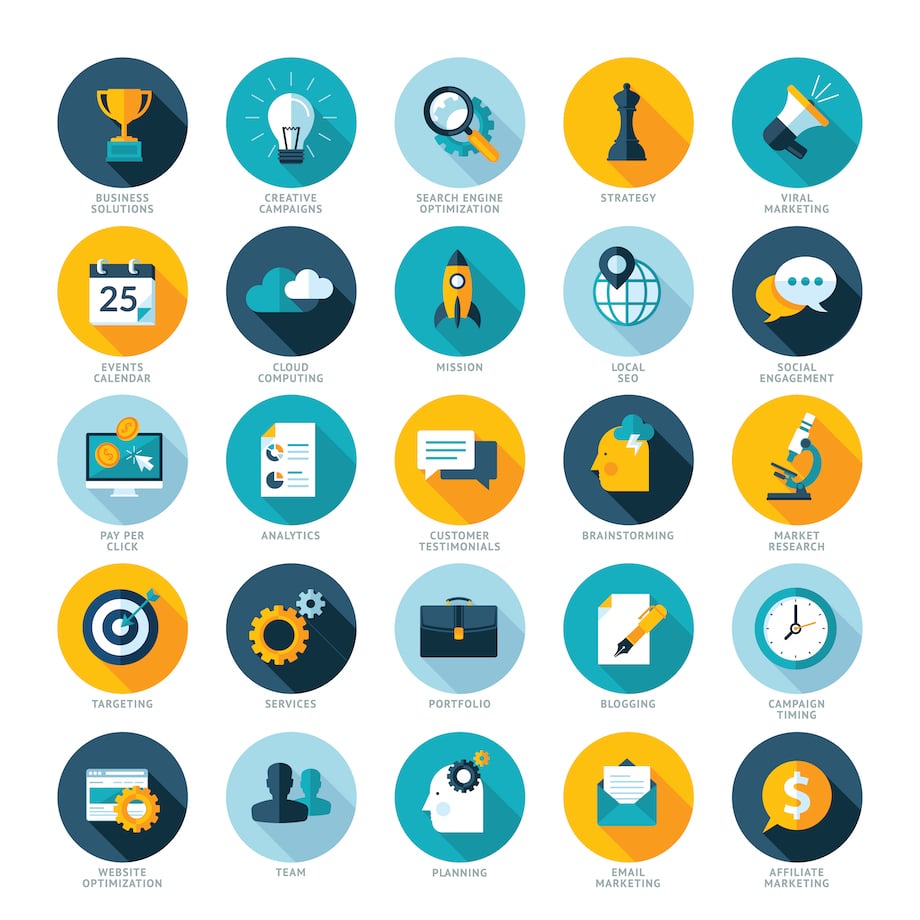
4. Use visual cues and icons
Visual cues are elements on a web page that draw attention to areas of importance and help users interact with your site. They typically direct a person’s attention to a certain section, like a call-to-action (CTA) or a product. Common visual cues are buttons, like “click here” or “submit.”
Icons are used to provide visual representations of different categories or sections, making it easier for users to identify what they’re looking for quickly. There are generally one or two places on a page where icons are gathered as separate graphic files or as a single image map. Hypertext links, a company logo, or small images – like a camera or bullet list, are common icons used for web pages than typically link to other areas of your website.
When using visual cues and icons, it’s important to ensure that they are clear and easily recognizable. Use colors, shapes, and symbols that are familiar to your target audience and consistent with your brand identity. It’s important to avoid overusing visual cues and icons, as too many can be overwhelming and detract from the user experience.
5. Leave breadcrumbs to follow
Breadcrumbs are a type of secondary navigation that shows users their location on the website, the steps they took to get there, and provides links to the pages they’ve previously visited. By using breadcrumbs, you can help users understand the structure of your website and navigate it more efficiently.
Breadcrumbs navigation is often situated near the top of the page, underneath the main website navigation. Some examples include location, attribute, history, and path-based breadcrumbs.
- Location-based breadcrumbs: show users where they are in the website hierarchy and provide links to higher-level pages. For example, a location-based breadcrumb might look like this: Home > Products > T-Shirts > Men’s T-Shirts.
- Attribute-based breadcrumbs: show users the attributes of a particular product or page and provide links to other pages with similar attributes. For example, an attribute-based breadcrumb might look like this: Home > Products > T-Shirts > Men’s T-Shirts > Red T-Shirts.
- History-based breadcrumbs: show users the pages they’ve previously visited and provide links to those pages. For example, a history-based breadcrumb might look like this: Home > Products > T-Shirts > Men’s T-Shirts > Red T-Shirts > [previous page].
- Path-based breadcrumbs: show users their path through the website and provide links to previous pages in the path. For example, a path-based breadcrumb might look like this: Home > Products > T-Shirts > Men’s T-Shirts > [previous page].
Breadcrumbs are typically displayed as a horizontal list of hyperlinked website pages separated by a greater-than sign (>). Breadcrumbs are especially useful for larger websites or websites with a complex structure, where it can be easy for users to get lost or confused. They can help reduce bounce rates by encouraging users to explore more pages on your website. Overall, utilizing breadcrumbs is a simple yet powerful way to create a more user-friendly and intuitive navigation structure for your website.
6. Use descriptive and concise navigation labels
Navigation labels should accurately reflect the content within each section and be concise enough to fit within the navigation menu without overwhelming users. You don’t want users to question what each of your pages or sub-pages is about. Generic terms like “products” or “services” may get users to your pages, but if they don’t know what your site is about, the vagueness of your labels may lead them to pages they aren’t looking for and increase the likelihood of them leaving your site entirely.
We recommend using your navigation to show your main services or products so these labels communicate instantly what these sections are about or offer. Consider your target audience’s language and terminology and use easily recognizable and understood labels. Avoid using jargon or overly technical terms that may be confusing to users. Vague or confusing labels can make it difficult for users to navigate your website and lead to frustration and a poor user experience.
It’s important to keep the labels consistent throughout the website to help users and search engines understand the structure of the website and navigate it more efficiently.
An outside perspective
To optimize your website’s performance and visibility online, consider contacting My Website Spot for SEO services. Our experts understand the importance of site architecture and navigation in web design to create a great user experience. Clear and intuitive navigation makes it easier for visitors to find the information they need on your website. To ensure your website is accessible on various platforms, we are determined to implement cross-platform compatibility with every site we design.
My Website Spot is always willing to provide free advice and welcomes you to browse our services and blog for more information. Drop us a line, and we’ll get back to you with answers to your questions, an outside perspective on your site, and strategies you can implement to raise your ranking on the search engine results page.